


Summary: In a time of swift technological progress, manufacturing is on the brink of a groundbreaking transformation. This piece explores my collaboration with the CN-Seamless team in implementing innovative technological solutions. I provide detailed insights into my design approach and how I contributed to CN-Seamless's product launch strategy. Concluding this case study, I offer valuable takeaways from a project of this caliber.
Introduction: Pioneering Change in the Welding Industry
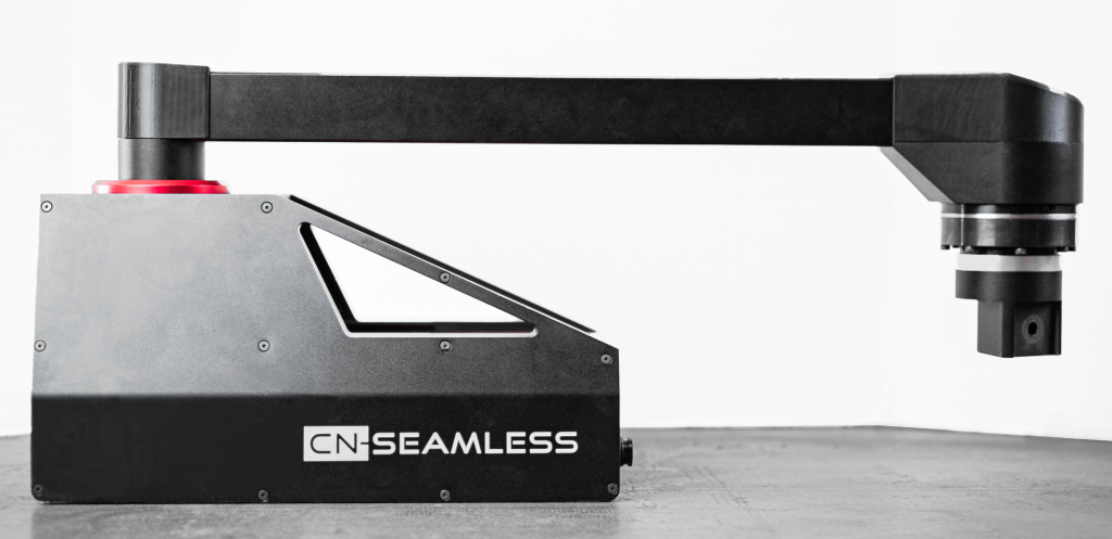
The CN-Seamless Mach 1 is a metal fabricator's dream come true. The innovative product merges precision robotics with portability, helping reshape industry production. Equipped with an oxy-fuel attachment, craftsmen can effortlessly shape steel up to 12" thick. The Mach 1 features a swift setup time of under 5 minutes and an intuitive interface that mirrors familiar cutting methods. Its compact build enables easy transport and storage, making it an ideal companion for any work site. I collaborated with the three founders of CN-Seamless and multiple software engineers to strategize, plan, design, and implement a user-friendly touchscreen interface for controlling the CN-Seamless Mach 1.
The Challenge: Bridging Tradition and Innovation
The founding team excelled in crafting the product's physical aesthetics and meticulous attention to detail. As the project progressed, they recognized the need for assistance in designing and developing the Human-Machine Interface (HMI) essential for controlling their machine. Upon joining the team, I discovered they had a basic UI prototype for machine control, yet it lacked the intuitive features characteristic of a traditional professional HMI. It became evident that users without specific training would struggle with the current interface, prompting the development of an initial software version before rolling it out to eagerly awaiting new customers.
I initiated the project by summarizing discussions on the team's vision for the machine control to design, position, define the material, and cut. These conversations helped me grasp the founders' intended process before aligning it with user interests. Once we outlined the operator's tasks, I delved into their audience and customer research to understand user needs. I then coordinated the research elements to present a preview of the planned HMI direction. To summarize the study, we found that the typical user for a machine like CN-Seamless is a seasoned welder or ironworker. The preferred persona comprises experienced trade workers familiar with cutting torches and metalworking tools. They show a keen interest in modern technology and a willingness to learn. However, many employees may not have ample training time with CN-Seamless due to time constraints and project deadlines. Hence, the interface must remain user-friendly, guiding them through the process.
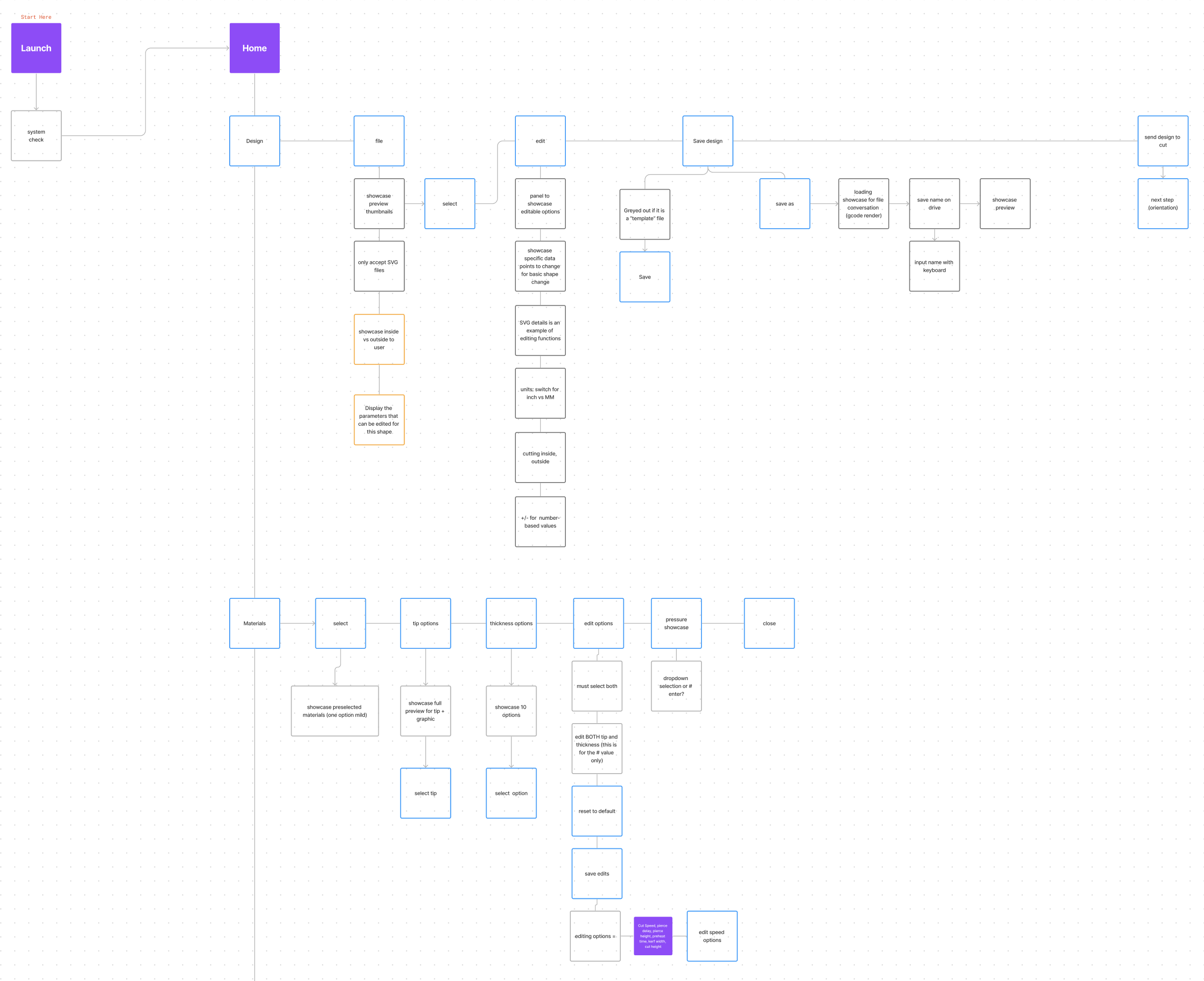
This led me to propose a Linear User Flow, which is more task-oriented, offering a step-by-step approach for the UX. While reviewing the strategic data, I shared early wireframes and ideas post-discussion. The initial concept was still far from its final design, requiring more research for new iterations.
Strategy and Planning: Laying the Groundwork for Transformation
After reviewing the first round of wireframes, I collaborated with the team to outline the user experience. In this session, I highlighted the specific updates to the journey, ensuring alignment with the envisioned ideal experience for controlling the machine. By outlining the ideal experience, we gained a comprehensive view of the user's journey before proceeding with the remaining wireframe designs. The team appreciated this process as it aimed to enhance their understanding of how the technician could complete the cutting process independently. The UX outlining or journey mapping process facilitated a focused discussion between the founders and me regarding the optimal steps users needed to follow for a successful cut. Throughout this process, we identified numerous questions affecting various aspects of the user journey. Starting with the outline enabled us to identify these issues and propose solutions before investing time in designing.
Afterward, I continued the project by creating new wireframes for the HMI. These low-fidelity screens allowed us to prototype the machine control experience before moving on to the high-fidelity design of the UI elements. Throughout this process, I used CN-Seamless' existing creative assets and machine product designs to inspire an interface that complemented their current branding elements. The key features integrated into the UI design were incorporating design tokens from the company's brand style guide, including aspects like shape icons, physical product design, and navigational cues.
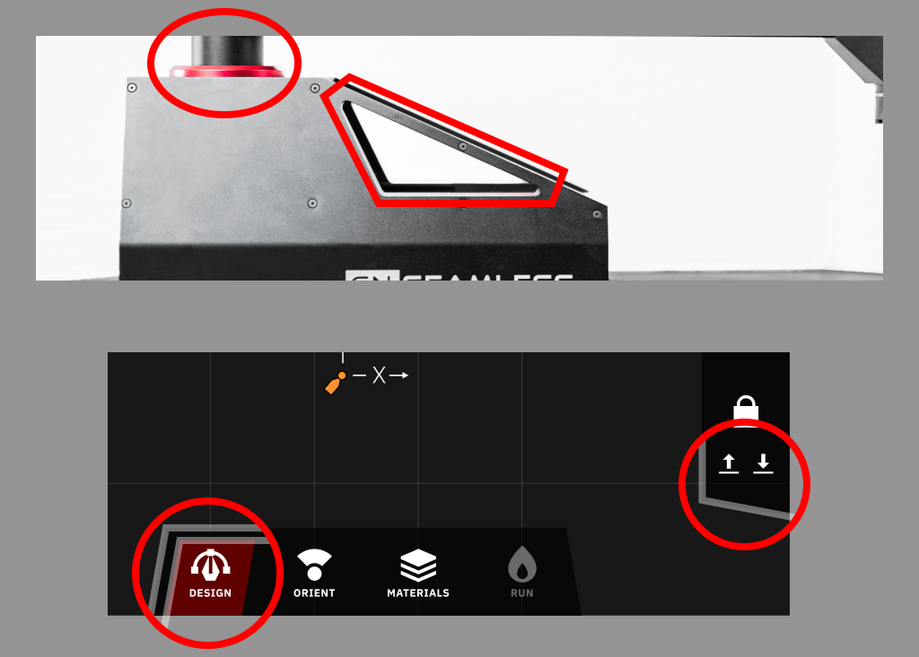
When examining the machine's profile (image below), you'll notice the triangular shape that functions as a handle. This unique aesthetic initially captured my attention with its delicate appearance that seemed incompatible with supporting the machine. Despite this initial impression, the handles proved to be very sturdy. While I aimed to incorporate these distinctive design elements into the HMI, focusing on the "triangle" shape of the handles was just one way to ensure alignment with the product's branding. Other subtle elements included a unified color scheme of red, black, and white, striking typography, and polished icons.
Revision and Refinement: Perfecting the User Experience
After multiple iterations refining the HMI's wireframes, navigation, and touchscreen interactions, we settled on an optimal UI design that we integrated into development. As we finalized the HMI design, I crafted over 40 screens to enhance and refine the UX outline I provided earlier. However, challenges during development, including various constraints and delays, warranted updates to the interface design and controls to align with the new customer delivery deadline. While there were some deliberations on the navigational aspects of the HMI, we ultimately agreed on a design to test, aiming to finalize it alongside a CN-Seamless Mach 1 cut.
The founders and I recognized the opportunity to enhance the UX by designing a more linear interface. We explored various navigation controls, ultimately settling on three primary navbars that would serve as the operator's controls depending on the specific step or action. While some may perceive incorporating multiple navigation bars for machine control as potentially confusing and inconsistent, the CN-Seamless project required users to complete four main tasks, each consisting of 3-4 sub-tasks, before initiating the machine to cut. These tasks involved designing the cut, aligning the machine's location, specifying the materials, and commencing the cut. By including three distinct navbars, we ensured that the essential tasks for completing a cut were displayed on the left side of the tablet. Additionally, two primary navbars at the bottom and right of the tablet provided access to the tasks-to-complete (bottom) and standby machine controls (right). When a user interacts with the bottom "task" navbar, the left-side navbar dynamically displays the available actions for the current step. The right-side navbar always grants immediate access to critical functions such as emergency stop, robotic arm control, and system homing. The image below illustrates the three primary navigation sections; visualize holding a tablet with both hands, utilizing the left and right navbars for efficient setup of cutting parameters.
As the operator progresses through each process step, they encounter the specific actions required to outline task details. For instance, various methods exist to achieve an orientation with the machine, such as using the machine's origin, angle, or axis based on the cut type. I've included a sample screen dedicated to the orientation process in the image below.
%2520-%2520Screen%2520-%25203.png)
After completing this process, the user specifies the materials at the job site to enable the machine to comprehend factors like material type, thickness, and custom parameters. During the design of the materials section within the app, we noticed the need for greater clarity while ensuring consistent NAV usage. Given the numerous options available for material specifications, I crafted a standard menu featuring prominent actions for user input before cutting (refer to the image below).
%2520-%2520Screen%2520-%25204.png)
Toward the conclusion of the process, I designed the cutting menu and the "paused" screen. In welding scenarios, cuts may deviate, necessitating a "stop" or "pause" in oxy-fuel flow to reposition the cut accurately. The "pause" screen incorporates an offset controller, allowing the operator to reposition the torch to the correct cutting location after an interruption. This functionality was integrated following testing by the founders and myself, where a slight misalignment in the cut was identified. Testing the new user interface in a realistic setting revealed this crucial missing component.
%2520-%2520Screen%2520-%25208.png)
Now that we had a solid foundation for the HMI, we worked closely with friends, family, and early customers to audit the experience. During tests with individuals unfamiliar with welding machinery, they completed the cutting process with minimal guidance from our team. Our role was to provide correct inputs rather than direct them on the next steps. While I generally advise against using friends and family for user testing, our founding team lacked the resources to engage with ideal audience members at this early project stage. Thus, I recommended conducting even limited user tests with external parties (not teammates) to identify potential obstacles to the HMI's intuitiveness. I was thrilled that the individuals we tested managed to navigate the process repeatedly using the intuitive design, showcasing the need to proceed with the initial HMI version for customers. As the design work concluded and the app's development was close to completion, the founders had only a few weeks left to finalize the build for local clients. We had to maintain our pace and deliver the first version as tested. After about three months of customer usage, positive feedback highlighted the intuitive user experience and the HMI's aesthetic alignment with the brand.
Impact and Lessons: Takeaway for Future Projects
After completing the initial round of customer deliveries, I parted ways with the CN-Seamless team, so I cannot provide the exact capital amount secured by the founders through the updated HMI design process. Nevertheless, valuable insights can still be gleaned from this experience. While this project has numerous takeaways, I would like to highlight some key lessons learned to conclude today's case study.
The primary takeaway that comes to mind is the direct collaboration and communication with the product founders. Leveraging their robust industry knowledge, experience, and technical proficiency, I collaborated with the team to swiftly identify specific requirements for an ideal audience member or operator to navigate a complex process like steel fabrication. A founder's firsthand experience in a steel mill facilitated discussions about the operator's work environment and the necessity for clear tasks within the HMI. Without the founders' in-depth understanding of the audience, we would have required more time with actual fabricators to grasp their needs thoroughly.
From concept to a fully-fledged HMI, the project took around eight to ten weeks, a rapid timeline given the complexity of integrating the UI with the machinery. As highlighted in previous articles, speed is the key to a successful project and startup. The team and I diligently crafted an intuitive user experience, enabling the company to advance in client delivery and future sales, accelerating the product's market entry.
The final two takeaways from this project are equally essential. One key aspect was my commitment to remaining open and exploring new ideas with the founders and engineers regarding the design of the HMI's experience and design details. The initial design presented to the team and the finalized design currently in use are notably different, showcasing significant progress with new iterations within a short time. While not all ideas yielded the expected outcomes, I was willing to delve into new concepts for experimentation with the group. An iterative design approach enabled us to swiftly explore and validate the most suitable ideas for the development team before implementation, thereby conserving time and resources.
Another noteworthy point was aligning CN-Seamless branding with product and HMI design. As discussed in my recent post, "UI As A Competitive Advantage: Aligning Branding With HMI Design," many startups overlook the importance of aligning their branding with product development. In the case of CN-Seamless, although the founders were receptive to exploring fresh design elements for the HMI, I recommended incorporating as many branding elements as possible to ensure a cohesive business experience.
This strategic alignment ensures that when a new customer engages with CN-Seamless as a vendor, completes a transaction, views the product, and interacts with the HMI, they encounter a consistent brand experience from start to finish, reinforcing the solution used to accomplish their task. Startups often neglect this seemingly minor yet crucial detail, where product design and marketing strategies may diverge, leading to disjointed efforts. While marketing and product design may not require identical executions, utilizing consistent design elements across both functions enhances the overall customer experience.
Key Takeaways
- Adopt an Iterative Design Approach: Testing and validating ideas through iteration is crucial to utilize time and resources efficiently. This approach allows for the rapid exploration of concepts, ensuring that only the most promising developments are pursued further.
- Leverage Founder Collaboration: Engaging founders in the design process ensures that the product reflects the core business vision. Their insights can guide the alignment of branding and product development, fostering innovation and relevance in the market.
- Focus on Customer Experience Consistency: Prioritize a unified experience across all platforms and interactions. This consistent customer journey builds trust, enhances brand recognition, and improves customer satisfaction.
- Ensure Branding and Product Alignment: A consistent brand experience across all customer touchpoints is essential. Incorporate branding elements into the product and HMI design to maintain cohesion and reinforce your brand identity throughout the customer's journey.


